
The tutor comment on the photo above was that it was a good photo and almost answered the brief. I have to say I think it does answer the brief. Having said that I wonder would any of theses be better;


Pointed.

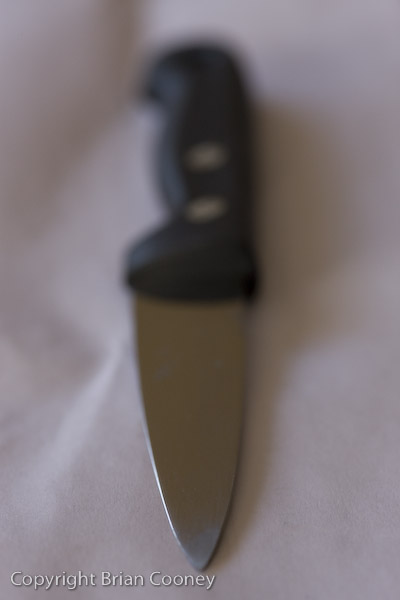
He suggests that this might be better as an example of pointed if seen with the corresponding image of blunt. I think I was thinking of sharp, not pointed.

Perhaps the two example above are closer to pointed.


As are the above.
Blunt.

The feedback on this was that the composition was good, the soft focus was good but that it was more representative of a hammer than blunt. I was thinking of the cliche "as blunt as a hammer" and I don't strictly agree with his interpretation, probably because its my photo.

I wonder if this would meet the brief better?

Or this?
Transparent.

He suggests eliminating the horizontal line in this.

Thick.

He suggests that I use a thicker book.

This is closer to the brief I think.
Weak.
The feedback for this is that it is hard to see or understand exactly what it is. I think context is the problem here.


This has better context but does not represent weak.

This is better. I think now I would re shoot this using a chain with a broken link.
Many.

His comment on this was that is could be misinterpreted as matches. Also the focus is on the text here and not on the matches. I think if I had cropped right in on the matches it would be closer to many, this changes the context.

This is better.


As are these.
No comments:
Post a Comment