Thursday, June 17, 2010

project 61; Making the best use of built in Flash.

A shot with direct flash, a book, so what? Well I was browsing for ideas on the strobist flickr group and I came across some interesting photos where the light had been fired through a frame or template to give a more interesting effect.
Here I have cut a piece of cardboard to give the effect like venetian blinds, its more interesting. The flash was fired directly at the subject.
Same again, I like the way the light is focused here.
I used a household colander here.

Here I have photographed a colour subject with no flash. Too much in shadow I think.
Here direct flash. I ike the dark surround caused by the high shutter speed but do not like the bright highlights. Lots of contrast, very dark shadows. Overall a harsh effect.
Here I have bounced the flash off the ceiling. This is the best of the series in my opinion. The reflected light is more even, and the edge details on the petals are better, there are still shadows but they have more detail. The contrast is better.
Direct Flash. the subject is on a white background. The camera and light are positioned directly above the subject. The flash power was reduced to 1/128th of full power.
Here the flash is bounced off the white ceiling above, I prefer this to the previous one. The shadow adds something to the shot, contrast. Also the outline is crisper. Flash was on full power.
A silver(tinfoil) reflector was used to reflect the light downwards onto the subject. I prefer this to the last, the light is less harsh.
Again a tinfoil reflector but this time from the right hand side, I like the light here the shadow of the pine cone can be seen and the shadows are good. Nice contrast.

The above 3 are from left to right, no flash, flash on full power and flash on 1/128th of full power. The distance from light to subject is about 1 meter. The first one has shadows under the eyes and around the face, you can see a reflection from a surface below. The second is typical of flash light, overexposed and white. The last is o.k, there is enough light around the eyes but its still not great.
These 3 photos are a similiar subject but the results are slightly different. The first has no flash, I wanted the edge lighting on the hair. In the second shot I have bounced the flash off a white ceiling, I like the light best in this one of the three but the results are still harsh. The final one is direct flash and looks the worst of all 3. Too white and harsh. One thing to be careful of in front of a window like this is to stand to one side to avoid the reflection.
In conclusion Direct flash is very harsh on the subject. Reflected or bounce light is more natural looking. I have not shown any diffused direct light here but I can see how this would be preferable over direct flash. Also it is better to get the flash off camera. However direct flash can be used to create interesting effects too, it depends on the image one has in mind.
I do not have an on camera flash, I used a canon speedlite 580 hotshoe unit.

Wednesday, June 16, 2010

Project 60;Shiny Surfaces

This is the first of the photos without any paper construction around the tea pot. You can clearly see the camera and me in the reflection. In the next few photos I have moved the light around to different sides of the teapot. It is very difficult to see how it would be possible to remove the reflection except by using something to block it, or hide it. I guess the other possibiliy would be to clone it out in photoshop.


Even by rotating the teapot the lens shows up.


Project 59; Concentrating light.

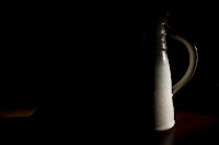
This was great fun! I made a snoot from a piece of black paper. I am going to keep it as I think it could be very useful. I shot the jug from the previous project and moved the light around to highlight different parts of it. There was a great deal of trial and error involved. The light can be used to highlight different aspects of the subject.


Project 58; Contrast and shadow fill.

This photo was taken as instructed in the course notes. I positioned the light source (a speedlite) on the viewers right of the frame. The light source was used without a diffuser and I used a flash meter to set the exposure which was F16 and 1/250th second. Without doubt this is the photo with the strongest contrast in the series. The shadows are very dark and the highlights are very bright.

This is the second in the series, the light source is in the same position but this time I have used a diffuser positioned just outside the frame and as close to the subject. The exposure was checked first with a flash meter and was 1/250th of a second and F8. the amount of diffused light that leaks around the subject is clear to see in this shot.

Here I have used the same exposure as the first shot and placed a white reflector 3 feet on the other side of the subject and opposite the light. This has filled the shadows.

Same exposure, naked light source and white card reflector moved to within 1 and 1/2 feet to the opposite side of the light, again the shadow fill is easy to see and more than the previous photo.

Exposure 1/250th of a second and F16. Light source is one undiffused speedlite 3 feet to the right. Shadow fill here is achieved using the duller side of a piece of tinfoil. Interesting, the shadow fill is uneven compared to the previous shot with the white reflector. There is hardly any shadow fill on the bowl, now this could be because of the position or angle of the reflector.

Exposure is as noted for the previous photo, the light source has not changed. The only thing that has changed is the reflector. This time I am using the shiny side of the tin foil. The shadow fill is greater, the greatest amount so far.

The only thing I have changed here is the reflector. The tinfoil has been crumpled and then straightened out. The shadow fill is again different and more like the white card. The difference between this and the previous shot is that the shadow fill is more even, more diffused perhaps? comparing this last shot to the white reflector, the white gives a more even shadow fill.

Here I have used a gold covered reflector. The shadow fill is less.

Here I have placed the light behind the subject to get a silhouette, I wanted to compare this with the next few shots.

Same exposure but this time using a grey reflector behind the lens to give a little shadow fill.

Here a dull silver reflector has been used to give more shadow fill.

Here I have used the tinfoil again crumpled. Nice shadow fill, not too much.

Here I have used the light source on the right and a black piece of clothe on the left to darken the shadows. I can see very little difference between this and the first shot in the series.

Tuesday, June 15, 2010

Project 57; The Lighting angle.


A good silhouette in the first shot with the light source from behind. The next two show the effect of the light source from behind and to the side. Again the position of the light source enhances the edges of the subject.


The first shot uses the light source on the right side and below the subject, it makes the eyes look slightly creepy. The second is to the left and from in front, the effect here dumbs down the facial features. The third is taken with the light source from in front.


The first photo uses the light source on the right side. the second on the left and the third from in front and slightly above. The middle photo is probably the best 3D effect of the series and is my preferred, I like the even overall lighting and the slight modeling effect .


The first photo above has the light above and to the left. The second has the light source to the left and on the same level. The modeling effect on the nose is very noticeable. The third photo has the light source on the right but below the statue. The colour difference in the material is clear to see.

All there of the above were taken with the light source pointed down at an angle of 45 degrees and moved around the subject. The first shot has a nice modeling affect on the statue. The second one uses the light source behind and above the statue and gives a nice silhouette with some high lights on the shoulder and the robes. This photo and the next make the materials look like teak. The textures on the head of the statue show up well.


The three photos above are shot with the light source from directly above the statue. The first is directly above and slightly to the side. It has a nice modeling affect on the statue. The second is from directly above and slightly to the front of the subject, the lines and details in the face show up well. The final one is taken from directly above and behind. This one shows the edges very well and is almost a silhouette.