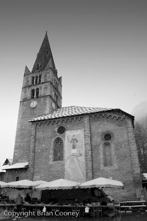
Photo 1.

I took this photo for the colours and shapes. My tutor agrees that these are good commenting that this is a powerfully graphic image. As this is my first image he says that it should immediately grab ones attention and explain what the essay was about and that perhaps a wider shot of the market would be better. Also he likes the fact that the eye immediately alights on the one star on the lower right he feels that I could have used deeper depth of field to draw the eyes upward rather than down. I see what he means about that however I do feel that this star is like positioning a single point. As for wider shot of the market, I have to admit that I never considered this as a photo essay. I went looking for strong single images in the same places over several weeks. I did take a lot of wider shots but I never considered them to be good enough to submit.
Above are some of them.
Photo 2.
For this shot he suggests that I remove the text as it is distracting. He does say that it is English text and he is right, this never struck me at the time.
This is better.
Photo 4.
Again the suggestion is to remove a distraction. This time the orange detail in the top left hand corner.
I agree that this is a stronger image.
Photo 5.
While he likes the composition he does say that it is a pity the customer is not facing that camera because its always more engaging to see someone's face. In this instance I could not do much about that. His second criticism is about the distracting sign in the background and he also thinks I could cut down on the dead space to the right.
This is definitely better.
Photo 6.
Here while he agrees that this has great atmosphere but feels that more people in the shot would have added interest. I agree however there were no more people. I did take some other shots that day and I add them below.
I guess this has something of the atmosphere of the first one.
This has atmosphere too.
Photo 8.
This image received good feedback however my tutor feels tah I should have continued to deepen broaden the theme.
Photo 7.
One detail too many was how my tutor described this.
When I look back now I had several images that would have linked the essay together better for instance like this;
I rejected it because its not sharp but it would have been better than the last one. Or this;


No comments:
Post a Comment